“I am interested in books when their purpose or meaning fits with my interest, or when they teach me something
or rectify some wrong concept I had, or look beautiful, or make no sense, or are extremely well done, no matter
which is the classification or profession of the author.”
– Daniel Buren, Art-Rite, Vol. 14 (1977)

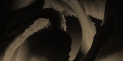
Daniel Buren, ‘Photo-souvenir de l’Azur au Temple du Ciel, travail in situ, Temple du Ciel, Pékin’, October 2004. Temple of Heaven, Beijing, China Detail © D.B. – ADAGP Paris
There is something almost ironic about an artist who has spent six decades insisting that art belongs to the world – to streets, billboards, and the social fabric of everyday life – being celebrated in an exhibition about books.
But Pages in Situ, the upcoming show at Lisson Gallery, curated by graphic designer Fraser Muggeridge, makes a compelling case that Daniel Buren’s engagement with print has always been, in its own way, just as radical as anything he pasted to a Parisian wall.
The display attempts an entire history of the stripe as subversive interruption within books, catalogues, magazines and publications, drawing together over 100 printed items that span the full arc of Buren’s career. It is a surprisingly rich archive. The exhibition begins with Buren’s anonymous contribution to the Prospect 68 catalogue at the Kunsthalle Düsseldorf – a double-page spread of green stripes – and ends with a new version of an off-site billboard work first staged in central London in 1972. That span of nearly sixty years is navigated with admirable concision.
Daniel Buren, ‘Pile Up: High relief no B5’, 2017
What makes the show more than a bibliophile’s curiosity is the consistency of Buren’s logic across every format. Variations in colour, sequencing, cut-outs and format all play a role in shaping each item, yet his consistent “visual tool” operates as a powerful graphic element, threading through each publication while continually shifting in form and intent. Muggeridge, whose own practice is rooted in typography and artists’ publications, is an astute guide through this material: attuned to the way Buren bends the conventions of the printed page as deftly as he bends those of the gallery wall.
Several examples adhere to the 8.7cm principle without explicitly displaying stripes at all, using the same width for columns of printed text or for the dimensions of reproduced images. This is Buren at his most conceptually mischievous – the motif present as an invisible structural principle rather than a visible mark.
The show extends beyond print. The upper gallery contains fragmentary striped installations from 1968 and 1980, applied directly to the wall and extending to touch the extremities of the space. And the accompanying off-site commission – a reimagining of the 1972 Shaftesbury Avenue billboard, now in cyan and relocated to Camden’s Eversholt Street, running 1–28 June – usefully reminds us that for Buren, no exhibition is ever fully contained indoors.
Since 1965, Buren has used his 8.7cm-wide vertical stripes as a starting point for research into what painting is, how it is presented, and more broadly, the physical and social environment in which an artist works.
Pages in Situ reveals, with quiet authority, that print was never a sideline to that enquiry — it was always part of it.
Pages in situ opens on 11 June to 22 August.
All images copyright and courtesy the artist and Lisson Gallery.
Header: ‘A Perimeter for a Room work in situ’