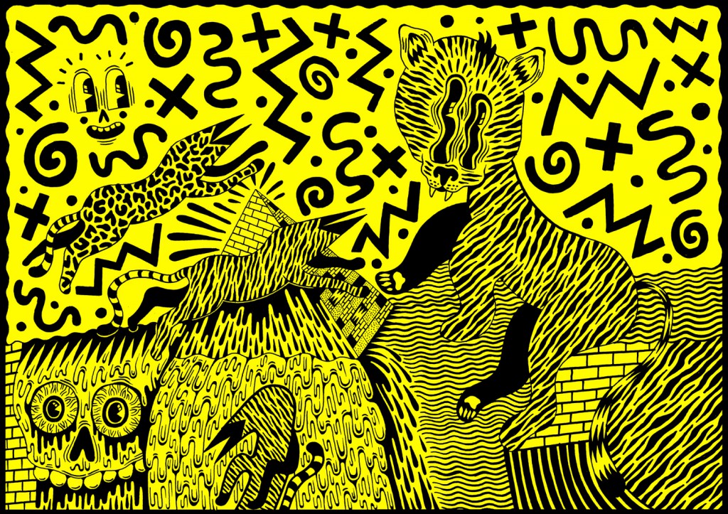
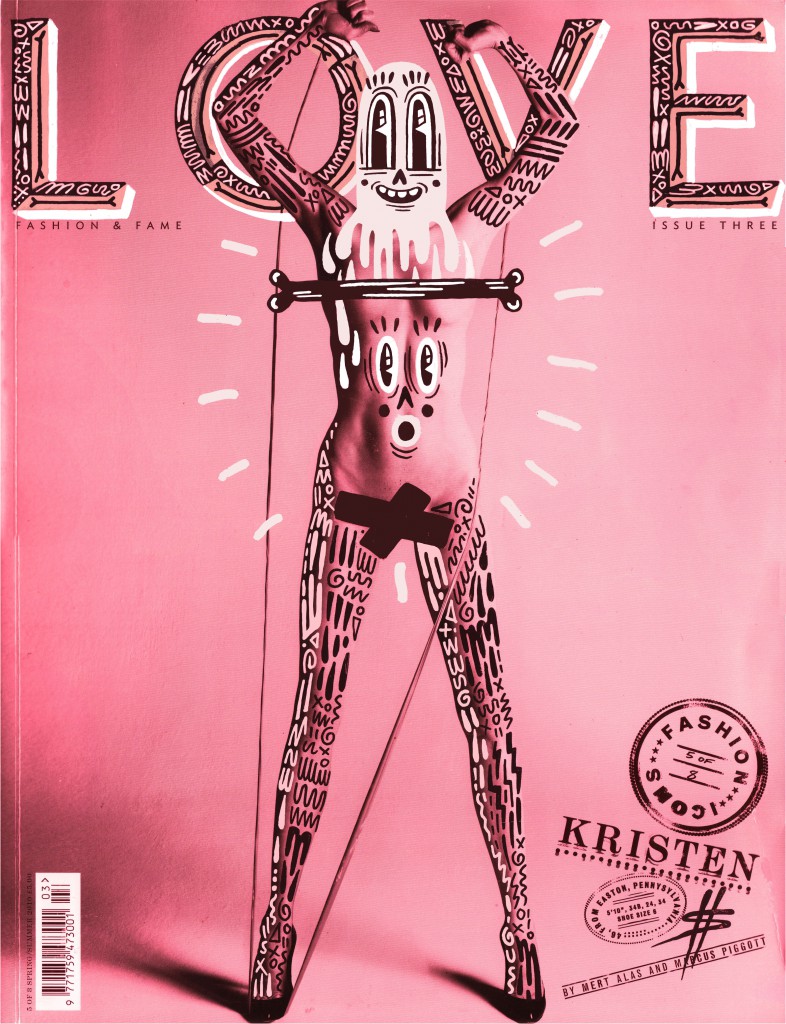
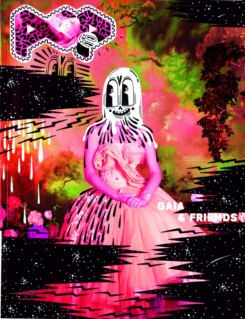
Contemporary illustrator Hattie Stewart is lucky to be working right now: never has our appetite for original imagery been so great, nor are we so excited by it. Not only will your work be tumbld and pinned widely online, our hunger is sated everywhere IRL on walls and in windows. We were double-teamed by Hattie’s work in both arenas: her sacred-cow slaying refixes of fashion mag covers made us LOL online and her vivid work in Hoxton Square struck us down. A creative with an exceptional, bright and chaotic vision, it’s unsurprising her star is on the rise.
Prime Planet: To kick off, when did you first realise the creative profession was for you?
Hattie Stewart: I have always had a love of drawing so feel it was always going to be a natural progression from an amateur doodler to a professional one! I try to be professional as much as possible but sometimes slip up. Standard!
PP: So as an illustrator and during your artistic career, what are your favourite mediums to work with?
HS: I prefer to use Posca pens, they are the best for me to draw with plus the colour ones enable me to add in extra details which is extremely satisfying!
PP: What pieces of work that you have created are you most proud of?
HS: I’m proud of all my work really I like to look back on it sometime to see the progression of then to now. At the moment though I’m really enjoying my work with House Of Holland, great briefs!
PP: What are your main sources of inspiration?
HS: I love to watch Documentaries when I work, The September Issue, Beautiful Losers, Art & Copy etc and reading the biographies of people I admire, Jane Fonda, Mia Farrow, Ingrid Bergman. Reading and watching about another’s life, struggle and their ultimate achievements is a great inspiration. That and my friends.
PP: In terms of the big beautiful city itself, what’s your favourite part of London to be and why?
HS: I guess East London. I’ve lived here for almost a year now and love that it’s such a creative hub. It is perfect for someone like me who’s always looking out for new opportunities, collaborations and projects!
PP: Some creatives in the modern world have mixed views on this: Do you prefer working to a digital outcome or physical copy and why? Print or web for example?
HS: I honestly like both. I have no problem with working digitally, it’s great for working at a faster pace and for making corrections but if I’m honest I do prefer physical pieces, like when I paint. To view a completed piece knowing that you created it is so satisfying. It is about using your own physical skill and fine-tuning it as much as possible. There is nothing that beats hearing the line “How did you do that?” and knowing you did it by hand. I do believe it’s more impressive than digital but that’s just my opinion.
PP: If you were a colour and one that describes your personality the best, which one would you be and why?
HS: Fluorescent pink. Because it’s cheeky.
